

.svg?format=pjpg&auto=webp)
.svg?format=pjpg&auto=webp)
.png?format=pjpg&auto=webp)

.svg?format=pjpg&auto=webp)
.svg?format=pjpg&auto=webp)
.svg?format=pjpg&auto=webp)
.svg?format=pjpg&auto=webp)

.svg?format=pjpg&auto=webp)
.svg?format=pjpg&auto=webp)
.svg?format=pjpg&auto=webp)


.svg?format=pjpg&auto=webp)
.svg?format=pjpg&auto=webp)
.svg?format=pjpg&auto=webp)
.svg?format=pjpg&auto=webp)

.svg?format=pjpg&auto=webp)
.svg?format=pjpg&auto=webp)
.png?format=pjpg&auto=webp)
.svg?format=pjpg&auto=webp)
Getting Started with your First App
In this section, we will learn how to build a simple “Color Picker” app using the Contentstack App Framework. This app contains a Custom Field UI location, which provides a native color picker polyfill that Contentstack users can use as an input field.
This step-by-step guide explains how to create a Color Picker app and use it to select color as an input within an entry.
Prerequisites
- Contentstack account with access to Developer Hub
- Organization or Stack Admin access
- Node.js version 18 or above
- CLI installed on your machine
- Apps CLI Plugin configured for Contentstack CLI
- Understanding of App SDK
- Understanding of React.js
- Venus Component Library installed on your machine
Overview of Steps:
Set up and Register an App
As a first step, you need to create a project directory where you can work in. You can use the Contentstack Apps CLI Plugin to clone the Marketplace App Boilerplate for creating your project.
- This command allows you to create or register an app in Developer Hub and optionally clone a boilerplate locally. Open a terminal and execute the following command:
csdx app:create - You will be prompted to enter a name for the app.

- Enter a name for your app and click enter. As per our example, we are using color picker.

- You will be prompted to choose an organization.
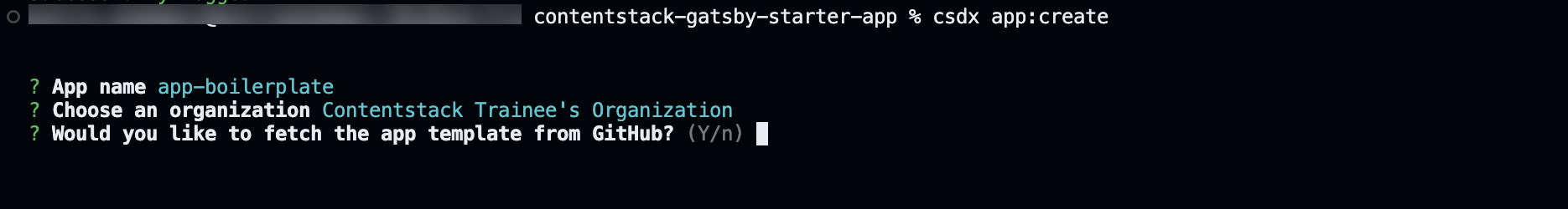
- Enter Y i.e. Yes, if you want to fetch the app template from GitHub (recommended). This clones the latest Marketplace App Boilerplate for stack apps.

Your boilerplate will be cloned locally in the color-picker directory and the app is automatically registered in Developer Hub.
- Switch to the newly created project directory from CLI using the following command.
cd color-picker
- Run the following command to install all the node modules.
npm install
- Run the following command to start the project.
npm start
This hosts your application on http://localhost:3000. We will connect to this through the Contentstack web app.
- This command allows you to create or register an app in Developer Hub and optionally clone a boilerplate locally. Open a terminal and execute the following command:
Install and Configure the App
The boilerplate app has sample pages for all the supported UI locations in the source code. To test the app, Install the app in one of the stacks.
- Run the following commands in a separate console window to keep the server running. Run the following command to install the app. You can also perform the same installation via Developer Hub.
csdx app:install - The CLI prompts you to select the organization and stack to install the app.

- Once done, you will see the stack URL for quick access to the stack. Open the Stack via the URL displayed in the terminal.

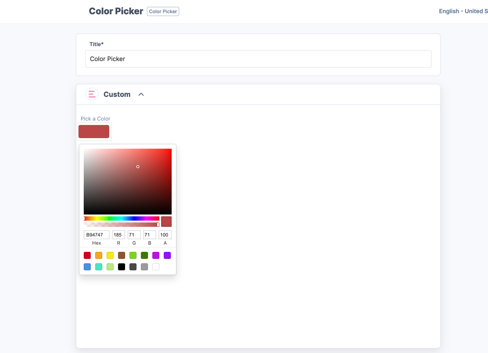
- Go to the stack in which you have installed the app. Create a new content type or navigate to an existing one. Select the Sample Custom field to add the Color Picker app.
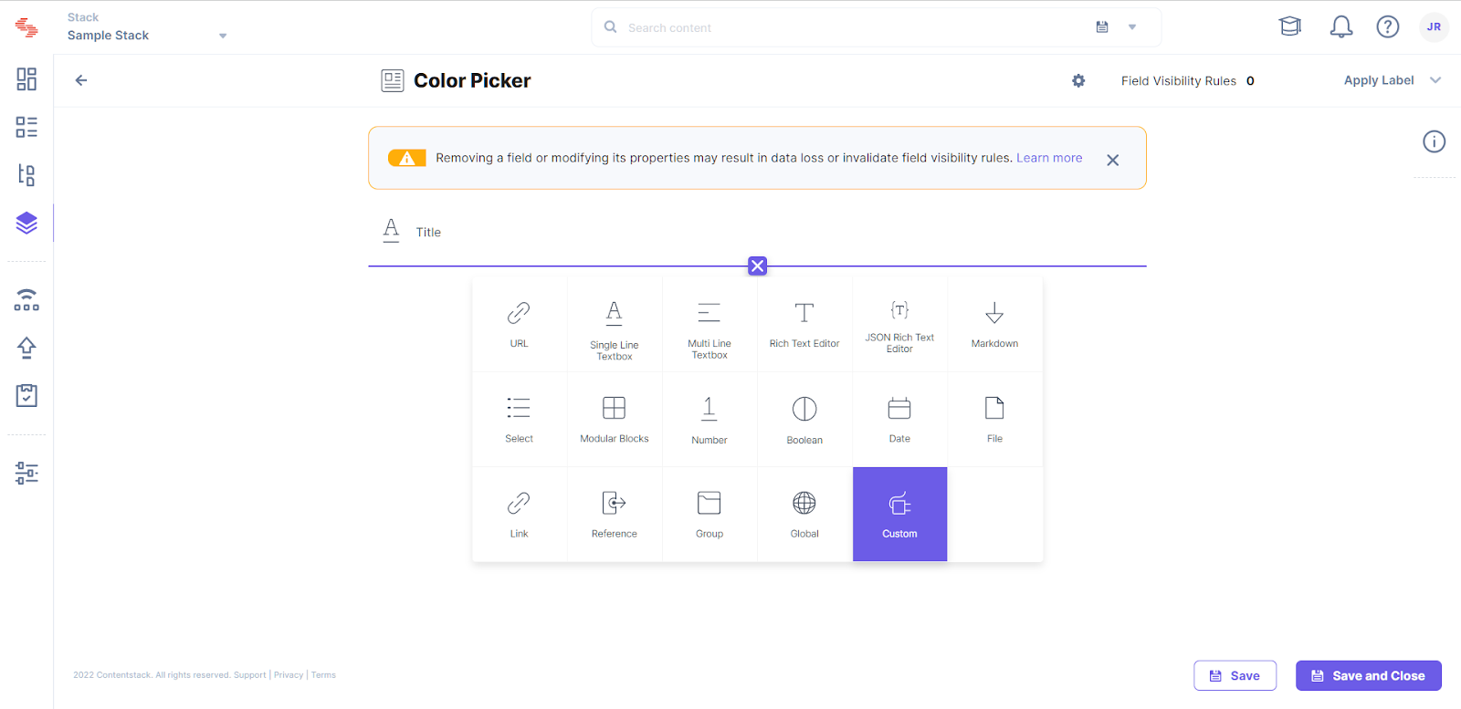
- In the Select Extensions or App popup, select the Color Picker app.
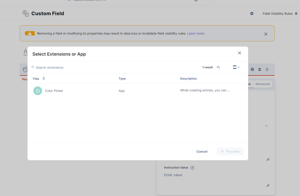
- Click Proceed.
- Click Save or Save and Close to update and save your changes to the content type.
- Navigate to the entries page. Create an entry for the above content type to see the app in action.
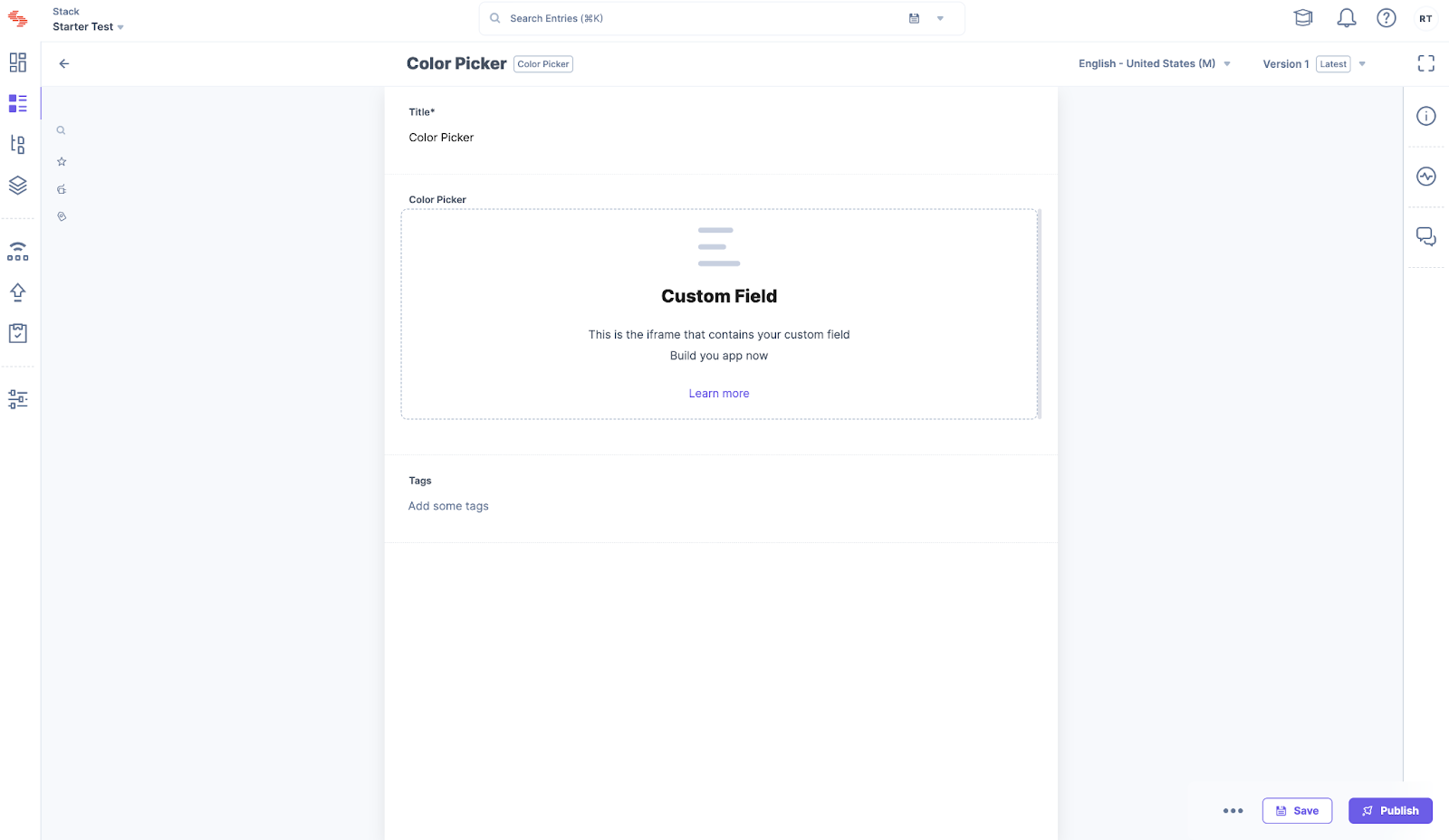
You will see a custom field as shown above.
- Run the following commands in a separate console window to keep the server running. Run the following command to install the app. You can also perform the same installation via Developer Hub.
Implement your Business Logic
- For the Color Picker app, you must install some dependencies. Run the following command on a terminal to install the dependencies.
npm i reactcss react-color @contentstack/venus-components
npm i --save-dev @types/react-color
- Add the Color Picker type to the Types in src/common/types/types.ts
export interface ColorPickerData { showPicker: boolean; pickerColor: { r: string; g: string; b: string; a: string; }; } - Replace the custom field code with the code given below in the following folder src/containers/CustomField/CustomField.tsx
/* eslint-disable @typescript-eslint/no-explicit-any */ /* Import Node modules */ import React from "react"; import { useEffect, useState } from "react"; import { Color, SketchPicker } from "react-color"; import reactCSS from "reactcss"; import { InstructionText } from "@contentstack/venus-components"; import { isEmpty } from "lodash"; /* Import our modules */ import localeTexts from "../../common/locales/en-us/index"; import { ColorPickerData } from "../../common/types/types"; import { useCustomField } from "../../common/hooks/useCustomField"; /* Import our CSS */ import "./styles.css"; const CustomFieldUILocation = () => { const { customField, setFieldData }: any = useCustomField(); const [stateColor, setColor] = useState<ColorPickerData>({ showPicker: false, pickerColor: { r: "108", g: "92", b: "231", a: "100", }, }); const styles = reactCSS({ default: { color: { width: "70px", height: "30px", borderRadius: "4px", background: `rgba(${stateColor.pickerColor.r}, ${stateColor.pickerColor.g}, ${stateColor.pickerColor.b}, ${stateColor.pickerColor.a})`, }, }, }); const togglePickerVisibility = () => { setColor((prev) => ({ showPicker: !prev.showPicker, pickerColor: prev.pickerColor, })); }; const closePicker = () => { setColor((prev) => ({ showPicker: false, pickerColor: prev.pickerColor, })); }; const pickerColorChanged = (color: any) => { setColor((prev) => ({ showPicker: prev.showPicker, pickerColor: color.rgb, })); setFieldData(color); }; useEffect(() => { if (!isEmpty(customField) && customField !== null) { setColor({ showPicker: false, pickerColor: customField.rgb, }); } }, [customField]); return ( <div className="layout-container"> <InstructionText testId="color-picker-text">{localeTexts.CustomField.instruction}</InstructionText> <div> <div className="swatch" role="none" onClick={togglePickerVisibility} onKeyDown={togglePickerVisibility}> <div style={styles.color} /> </div> {stateColor.showPicker ? ( <div className="popover"> <div className="cover" role="presentation" onClick={closePicker} onKeyDown={closePicker}> <SketchPicker color={stateColor.pickerColor as unknown as Color} onChange={pickerColorChanged} /> </div> </div> ) : null} </div> </div> ); }; export default CustomFieldUILocation; - Create a new file styles.css and add the custom field CSS with the code given below in the following path src/containers/CustomField/
.layout-container { padding: 5px; margin: -28px 0; } .layout-container .InstructionText { text-align: left; color: #647696; display: block; font-family: Inter; font-size: 0.75rem; line-height: 1.5; } .layout-container .swatch { padding: 5px; background: #fff; border-radius: 1px; box-shadow: 0 0 0 1px rgb(0 0 0 / 10%); display: inline-block; cursor: pointer; } - Add new strings to Custom Field object node in locales in src/common/locales/en-us/index.ts
CustomField: { . . . instruction: "Pick a Color", }, - Stop and restart your React project.
npm start
- Revisit the entry page to see the Color Picker loaded into the custom field.
- Save any color and reload, and verify if the app is saving data and fetching it on reload.
- For the Color Picker app, you must install some dependencies. Run the following command on a terminal to install the dependencies.
Next Steps
Host the app on Launch:
Now that your app is ready, you can host it on Launch for your team to use. You can also choose to host the app on external services like Netlify, Vercel, etc.
Secure your application:
Using the signed support, you can learn how to secure calls to outgoing APIs from the Contentstack UI and backend using the Contentstack App Framework.
Submit for publishing on Marketplace:
Once your application is production-ready and you want to share the solution with Contentstack Marketplace, you can check the App Submission and Approval Guide.
More articles in "Quickstart"
