

.svg?format=pjpg&auto=webp)
.svg?format=pjpg&auto=webp)
.png?format=pjpg&auto=webp)

.svg?format=pjpg&auto=webp)
.svg?format=pjpg&auto=webp)
.svg?format=pjpg&auto=webp)
.svg?format=pjpg&auto=webp)

.svg?format=pjpg&auto=webp)
.svg?format=pjpg&auto=webp)
.svg?format=pjpg&auto=webp)


.svg?format=pjpg&auto=webp)
.svg?format=pjpg&auto=webp)
.svg?format=pjpg&auto=webp)
.svg?format=pjpg&auto=webp)

.svg?format=pjpg&auto=webp)
.svg?format=pjpg&auto=webp)
.png?format=pjpg&auto=webp)
.svg?format=pjpg&auto=webp)
Omnichannel Content Preview Experience
Contentstack's Live Preview is an intuitive tool that allows content creators to view their work in real time across various devices and screen sizes before publishing. This ensures content is optimized, visually appealing, and consistent regardless of the platform or device.
Key Features of Live Preview
- Responsive Design Testing: Validate your content's layout and responsiveness across various screen dimensions.
- Device-Specific Views: Preview how your content will appear on popular device configurations to create a targeted user experience.
- Orientation Toggles: Switch between portrait and landscape orientations to ensure your content looks flawless in both modes.
- Instant Feedback: See real-time updates to your content as you edit, eliminating the need to save or publish for visual checks.
By streamlining the content review process, Live Preview helps maintain a consistent presentation across multiple platforms, enhances brand trust, and enables you to tailor content for optimal engagement on any device.
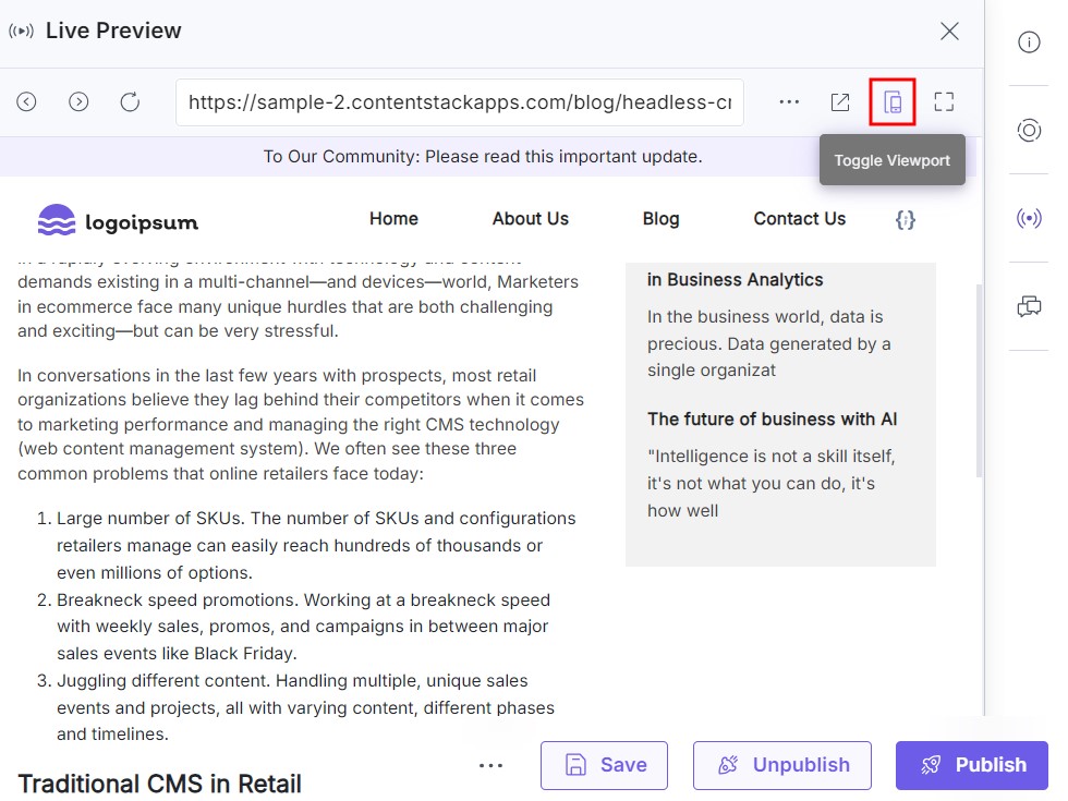
To preview your content, log in to your Contentstack account and perform the steps given below:
- Go to your stack and click the “Entries” icon in the left navigation panel or use the shortcut key “E” (for both Windows and Mac users).
- Select an existing entry and click the Live Preview icon.
- In the upper right corner of the preview window, click the Toggle Viewport button to access different preview modes for your webpage.
- Choose a preview mode from the dropdown menu:
- Responsive Mode:
Simulates how your content dynamically adjusts to various screen sizes.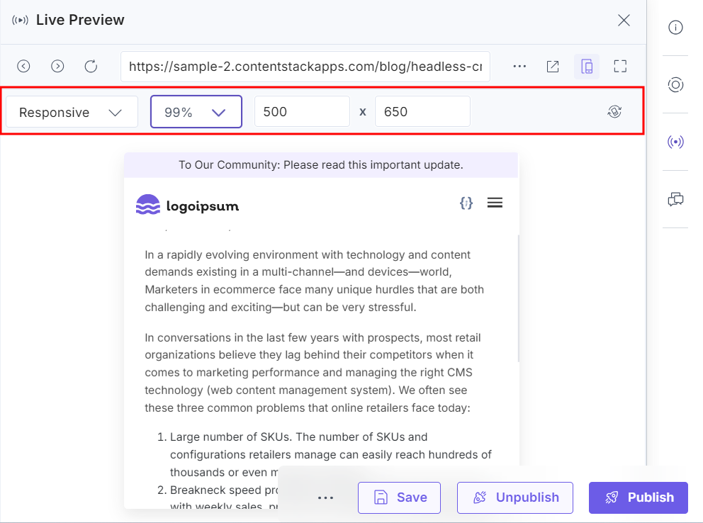
- Mobile/Tablet Modes:
Shows how your content appears on specific mobile and tablet devices.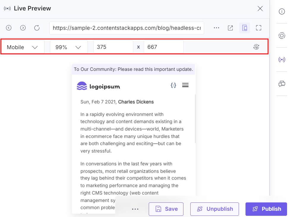 Note: The aspect ratios defined for mobile and tablet devices in the preview window cannot be modified.
- Responsive Mode:
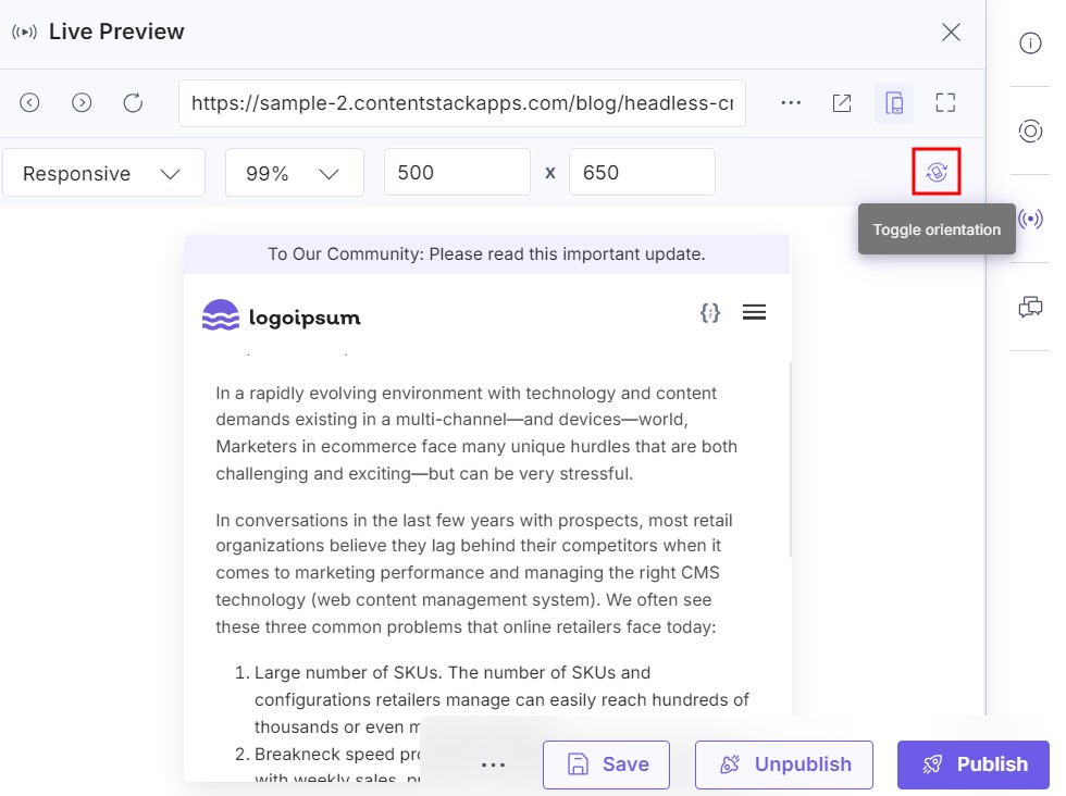
- Use the Toggle Orientation button to preview your content in both portrait and landscape orientations.
Make real-time adjustments directly in the editor, and see your changes instantly reflected in the preview window.
Was this article helpful?
More articles in "Work with Live Preview"
