

Real-world marketing site: four scenarios from build to launch
A grounded walkthrough of how a marketing team actually uses Studio. Each scenario is built from the same content types and components, demonstrating how a single Studio investment ships across very different page shapes.
This recipe pairs with the composable-studio-docs provisioning suite: clone it, run npm run provision && npm run setup, and you get the exact stack + project + entries this recipe is written against. No improvising. No inventing your own test data. The fixtures match the prose.
The setup we're building toward
A marketing site for "Studio" (the fictional product the docs use as the running example) with four kinds of pages, each demonstrating a distinct Studio pattern:
| Scenario | Pattern demonstrated | Composition kind |
|---|---|---|
| 1. Blog post page | Connected template + bound hero + related-posts grid | Connected template against blog_post |
| 2. Product page | Connected template + reusable Hero Strip section + testimonials | Connected template against product |
| 3. Case study | Featured Card section + Testimonial Card with Expose Props overrides | Connected template against case_study |
All four pages share the same registered components (Button, Card, Hero, Product Card, Testimonial Card). All four reuse the same three sections (Featured Card, Card Grid, Hero Strip). The section authors built them once.
The content types you'll have after provisioning
From the docs-suite manifest:
Plus three Global Fields that the sections bind to:
Scenario 1: Blog post page
Pattern: Connected template + reusable Hero Strip section + Card Grid of related posts.
Goal: every blog entry renders at /blog/<slug> with a hero pulling from the entry's hero Global Field and a "Related posts" grid below the body.
Build it
In Studio's "Studio Documentation" project, create a Connected Template named "Blog Post" connected to the blog_post content type:
The Hero Strip section was built once by the section author (linked to gf_hero). Now it auto-binds against every Blog Post entry. The same applies to Card Grid (linked to gf_card_list).
What you see when this is deployed
Visit /blog/welcome-to-studio and the hero pulls from that entry's hero field. The body renders the rich text. The Related posts grid shows two cards (the related posts the author picked in Contentstack: "Composition beats hand-coding", "Designing for speed").
Switch URLs to /blog/composition-beats-handcoding and the same template renders but with that entry's hero + body + a different set of related posts. One template, three (or three hundred) pages.
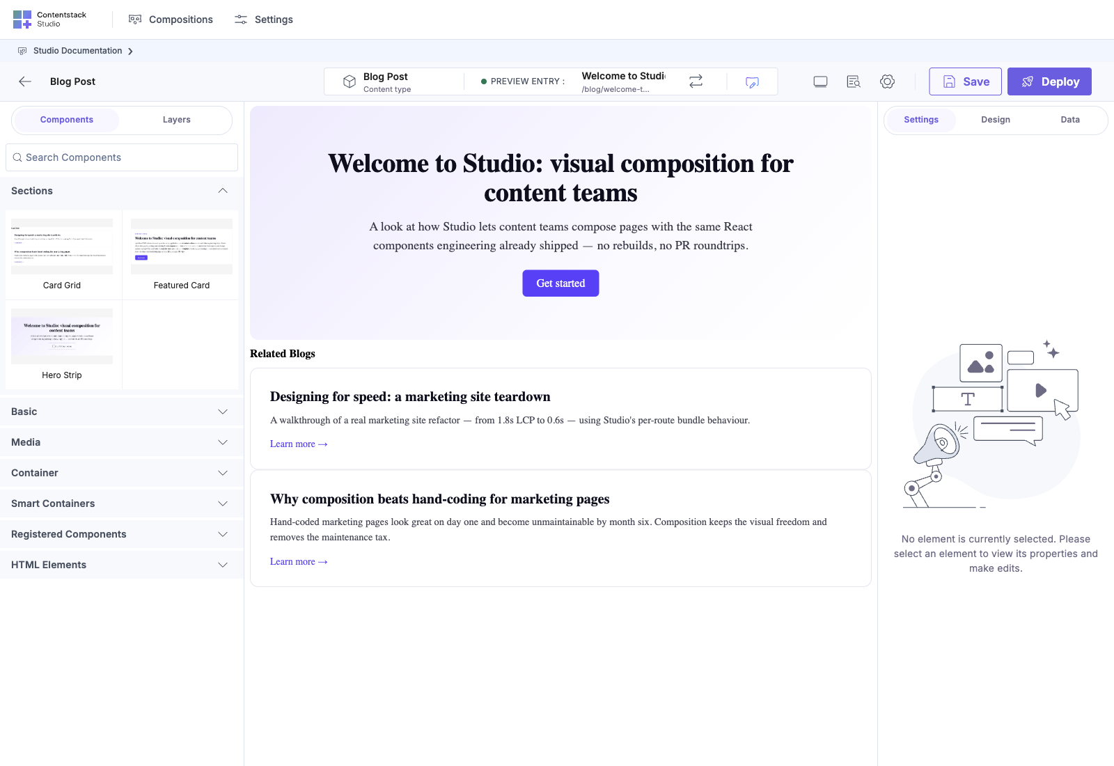
The canvas-overview screenshot is built from this exact pattern
The connected-template-canvas.png you see in What is Studio and elsewhere is the Blog Post template above, with the Hero component selected. The Properties panel on the right shows the Hero's prop bindings: headline maps to "Welcome to Studio", subhead to the welcome subhead, and CTA link to https://docs.contentstack.com/studio.
Scenario 2: Product page
Pattern: Connected template + same Hero Strip + testimonials repeater.
Goal: every product entry renders at /products/<slug> with the hero pulling from the product's hero field, marketing copy, and a testimonials section.
Build it
Create a Connected Template named "Product Page" connected to the product content type:
The Hero Strip section is the same composition you used in Scenario 1. Because its linked schema (gf_hero) matches both blog_post.hero and product.hero, Studio auto-binds it on each template without re-configuration.
What you see when deployed
At /products/studio-pro, the hero says "Studio Pro" / "Visual composition for small marketing teams" / Popular badge / "Start free trial" CTA. The body shows the tagline + description from the entry. The testimonials repeater renders zero or more cards depending on which testimonials the product was linked to.
/products/studio-cloud and /products/studio-enterprise render the same template against their own entries.
Scenario 3: Case study page
Pattern: Featured Card section with Expose Props, used to override the section's defaults per case study.
Goal: every case study has a "featured quote" callout. The section author built one Featured Card section. The template author can override its headline + body + image + CTA per case study, without forking the section.
Build it
The section author builds Featured Card once:
Exposed props on Save: all four. So template authors can override any of them per case study.
Then the template author builds Case Study (a Connected template against case_study):
Schema note. The seeded case_study content type has hero_image (file) but NOT a hero (gf_hero) field. So Hero Strip won't auto-bind on Case Study. Drop a plain Image bound to entry.hero_image instead, or extend the content type's schema with a gf_hero Global Field if you want the Hero Strip reuse pattern to apply across all three Connected templates.
What this demonstrates
The section author authored Featured Card once, with sensible defaults from gf_featured_card. The template author who built the Case Study template overrode the "Quote headline" exposed prop to compose a richer phrase that's not in the section's defaults. Other case studies (different entries) can override differently. No fork. Same Featured Card section everywhere.
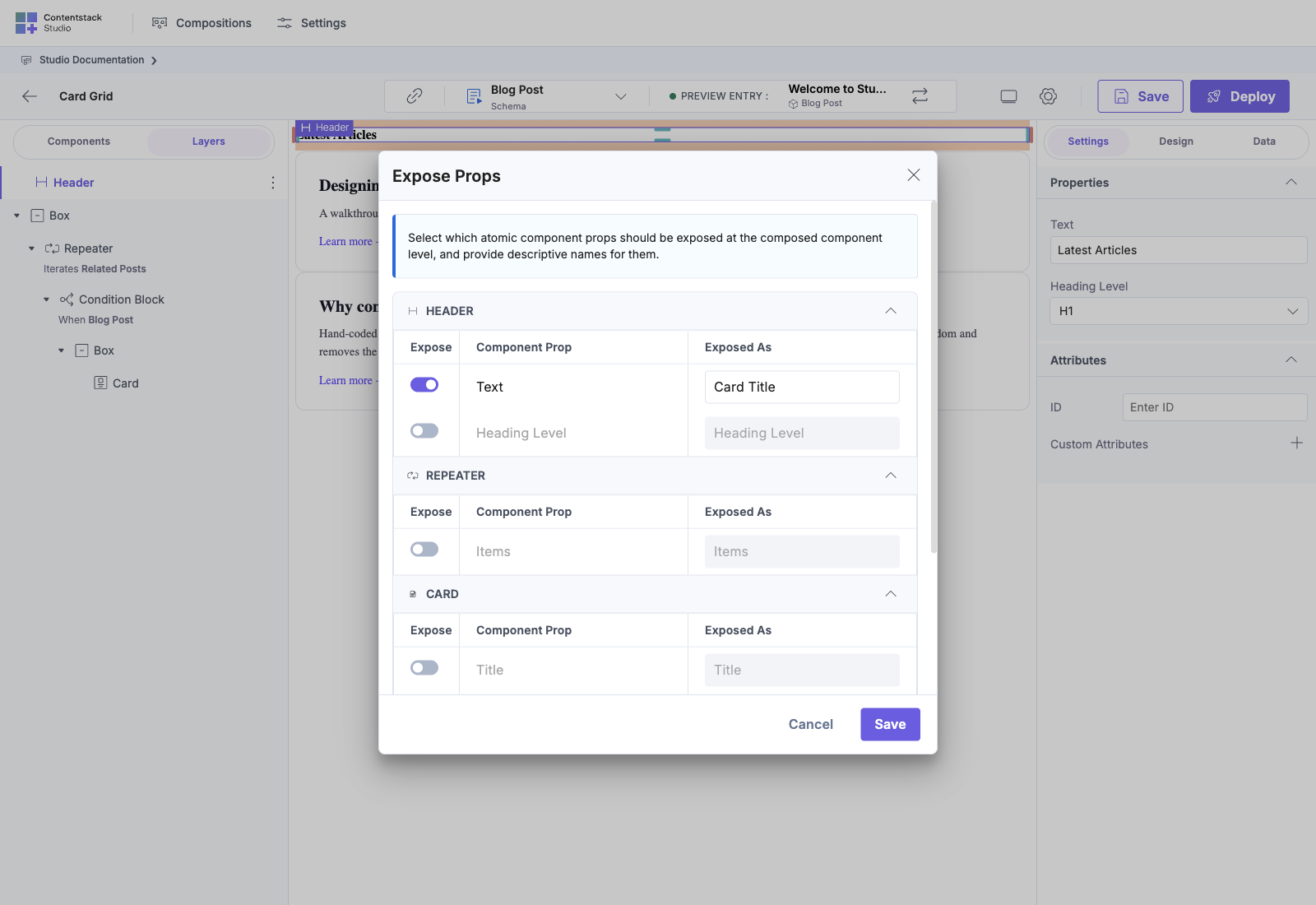
The expose-props screenshots are this exact pattern
expose-props-modal.png shows the Featured Card section's Save flow: four props listed, the section author deciding which to expose. Three of the four are toggled ON (headline, body, image) with "CTA label" / "CTA link" left internal (locked-in by the section).
The full set, viewed together
After provisioning the docs suite + building the three scenarios, your Studio Documentation project's Compositions list looks like:
And the canvas-app fixture serves all four URLs via <StudioComponent /> plus the /canvas route via <StudioCanvas />.
What it costs you to get here
- One-time content type modelling: six CTs, three Global Fields. ~30 minutes if you're using the docs-suite seed files, ~2 hours if you're modelling from scratch.
- Three sections: Hero Strip, Featured Card, Card Grid. ~1 to 2 hours each in Studio, plus the Expose Props decisions.
- Three templates: Blog Post, Product Page, Case Study. ~30 min each because sections do the heavy lifting.
Total: roughly a day's work for a designer + content lead pair to get from "fresh Studio" to "four real marketing pages live". After that, every new blog post / product / case study is a one-entry-update job for the content team. No engineering ticket per page.
What's NOT in this recipe (intentionally)
- Personalize variants. This recipe is about layout composition. Per-segment variation goes through Contentstack's Personalize, plumbed through the variantAlias in useCompositionData's second-arg CompositionQueryOptions (e.g. useCompositionData({ url }, { variantAlias })).
- Localisation. Adding locale: "fr" to the SDK init gives you French variants of every bound field, no extra Studio work.
- A/B testing. Same channel as Personalize. Not a Studio concern.
Once the composition layer is in place, those three run on top of it without changing any templates or sections.
Provisioning checklist
Before you can capture screenshots that match this recipe verbatim:
- cd composable-studio-docs && npm install
- npm run provision: paste your stack credentials
- npm run setup: creates CTs, GFs, entries, project, composition shells
- In Studio, open the "Studio Documentation" project and build out each composition's canvas (the canvas trees aren't seeded in v0.1)
- npm run dump:compositions: snapshot the canvases back so the next person who provisions gets pre-built canvases
- npm run recapture: refresh PNGs in studio-docs/assets/screenshots/
See composable-studio-docs/README.md for the full pipeline.
See also
- What is Studio: the conceptual intro this recipe makes concrete
- Enterprise day one: the same pattern, scaled to a real enterprise rollout
- Card grid with slots: deep-dive on the section pattern used in Scenario 1
- Overrides without forking: deep-dive on the Expose Props pattern from Scenario 3