Implementing App Locations: Custom Field
Implementing App Locations: Custom Field
The Custom Field Location of an app lets you add/ create custom fields that you can use in your content type.
Apart from using the default fields such as "Single-line textbox", "Rich Text Editor", and so on, you can integrate with numerous business applications, such as "Bynder", "Cloudinary", "Shopify", by adding them as custom fields to your stack's content type.
Contentstack loads this location of your app inside an iframe in the entry editing page. You can use the app sdk framework to access the entry data, manipulated it, and store your custom filed data into it. This will allow you to store field values in the entry from third-party systems such as Digital Asset Management systems Product Information Management systems, etc...
Use Case
One of the most common use cases in Contenstack to leverage custom fields, is typically when you want to manage assets from a different system and then bring the asset id and/or reference into Contenstack, so your editors can browse the Digital Asset Management system and choose their images from there and associate them with other content managed in Contenstack.
Similarly you can apply the same concept if you need to browse product categories or attributes from your Product Information Management system so, again, your editor can choose the right product discounts, product ids, product features, etc... when, for instance creating product promotional pages.
In order to read and save this values as a field as part of the entry you can refer to the following code snippet:
import ContentstackAppSdk from "@contentstack/app-sdk";
const [state, setState] = useState<TypeAppSdkConfigState>({
config: {},
entry: {},
location: {},
appSdkInitialized: false,
});
useEffect(() => {
ContentstackAppSdk.init()
.then(async (appSdk) => {
const config = await appSdk?.getConfig();
const entryData = appSdk.location.CustomField?.field?.getData();
appSdk.location.CustomField?.frame.enableAutoResizing();
setState({
config,
entry: entryData,
location: appSdk?.location,
appSdkInitialized: true,
});
})
.catch((error) => {
console.error("appSdk initialization error", error);
});
}, []);
Using the config and the entry objects in the state variable, you can now render your UI of the custom field location as per your requirement. If you need to save/overwrite the updated data to the custom field of an entry, then you have to use the state.location.CustomField.field.setData() function as shown below:
state.location.CustomField?.field?.setData(updatedDataThatHasToBeStoredInCustomFieldOfTheEntry);
Exercise 2
In this exercise you will add a button to your custom field, an input box and a modal. When the exercise is completed, you will be able to click on the button, open the dialog, choose a product id from it (hardcoded in this example, but you could easily implement the logic to retrieve the actual product id from your third party system), and save it as part of the entry data.
Using your code editor, access the file located at: src/containers/CustomField/CustomField.tsx
Import the following react components from the Contenstack venus components library:
import { Tag, cbModal } from "@contentstack/venus-components";
Create the following two new functions inside the component. This code will display a modal dialog upon clicking on a button:
const productModal = (props: any) => (
<ProductModal
updateSelectedItems={updateSelectedItems}
// eslint-disable-next-line react/jsx-props-no-spreading
{...props}
/>
);
const handleClick = () => {
cbModal({
component: productModal,
modalProps: {
onClose: () => {},
onOpen: () => {},
size: "xsmall",
},
});
};
Add the below code in the renderCustomFile function to replace the placeholder that says “{//add tag code here}”.
<Tag
version="v1"
tags={selectedItems}
onChange={(tags: any) => setSelectedItems(tags)}
/>
Next, create a new file named ProductModal.tsx in the following folder: src/containers/CustomField/
Paste the following code into the file:
import {
Button,
ButtonGroup,
Field,
FieldLabel,
ModalBody,
ModalFooter,
ModalHeader,
TextInput,
} from "@contentstack/venus-components";
import React, { useState } from "react";
import localeTexts from "../../common/locales/en-us";
const ProductModal = ({ updateSelectedItems, ...props }: any) => {
const [name, setName] = useState("");
return (
<>
<ModalHeader
title={localeTexts.CustomField.productModal.header}
closeModal={props?.closeModal}
/>
<ModalBody className="audienceModalBody">
<Field>
<FieldLabel required htmlFor="name">
{"Name"}
</FieldLabel>
<TextInput
type="text"
name="name"
placeholder={localeTexts.CustomField.productModal.placeholder}
onChange={(e: any) => setName(e.target.value)}
/>
</Field>
</ModalBody>
<ModalFooter>
<ButtonGroup>
<Button buttonType="light" onClick={props?.closeModal}>
{localeTexts.CustomField.productModal.cancelButton}
</Button>
<Button
buttonType="secondary"
icon="AddPlusBold"
onClick={() => {
updateSelectedItems(name);
props?.closeModal();
}}
>
{localeTexts.CustomField.productModal.confirmButton}
</Button>
</ButtonGroup>
</ModalFooter>
</>
);
};
export default React.memo(ProductModal);
Next, import this file into the CustomField.tsx component. Add this import to the src/containers/CustomField/CustomField.tsx file:
import ProductModal from "./ProductModal";
In that same field, make sure you associate the handleClick function with the button onClick property as follows:
<Tag
version="v1"
tags={selectedItems}
onChange={(tags: any) => setSelectedItems(tags)}
/>Save your file and make sure that your application is still running with no errors.
Tip: in case you might have experienced any issues or your application is erroring, the final code is provided in the src/containers/CustomField/solution-1.txt file, which contents you can copy and paste into the src/containers/CustomField/CustomField.tsx file.
Likewise, you can replace the contents of src/containers/CustomField/ProductModal.tsx with the solution provided in the src/containers/CustomField/solution-2.txt file.At this point your custom field is ready. In order to visualize it, you will need to create a content type or modify an existing one to use the Custom Field. You can read more about how to manage custom fields in our documentation portal, more specifically the Use Custom Field in Content Types section.
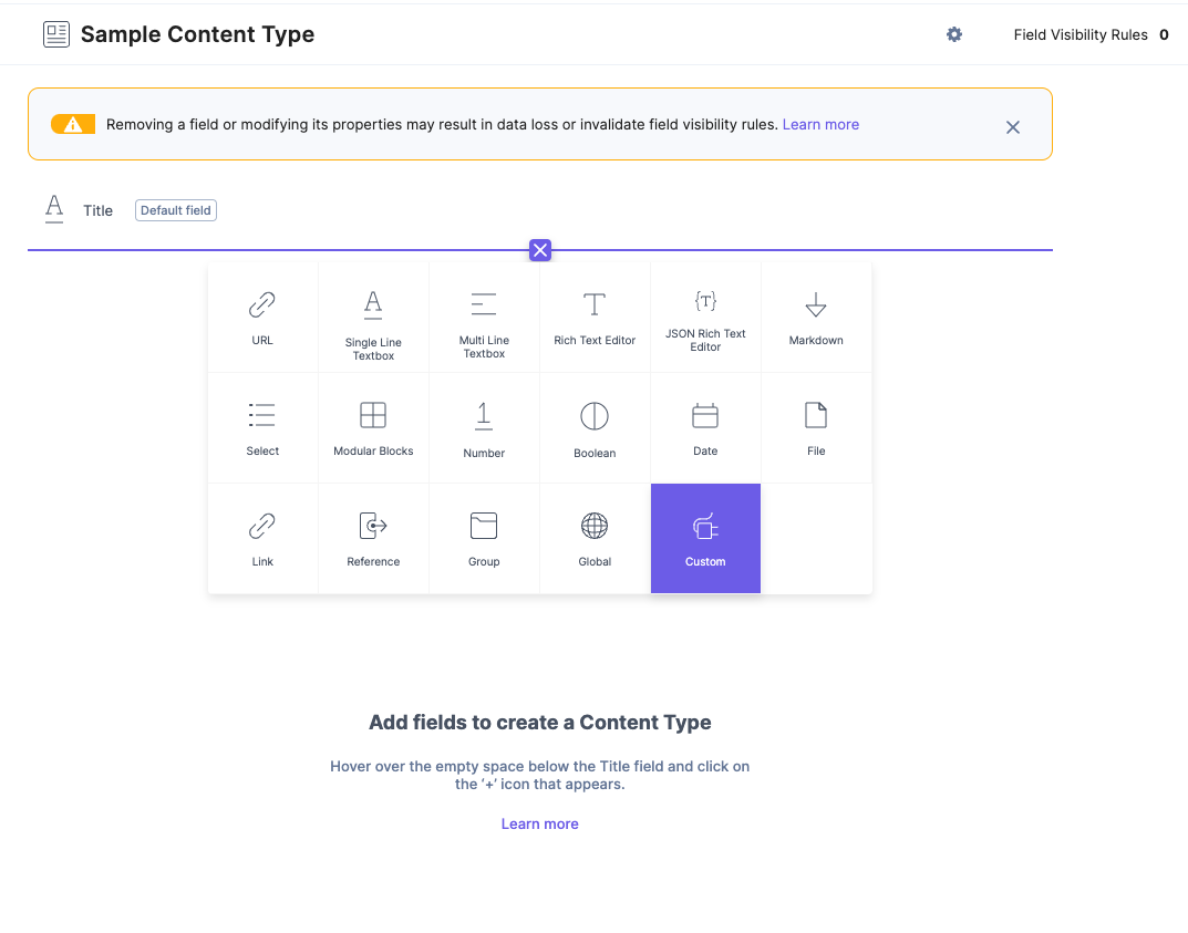
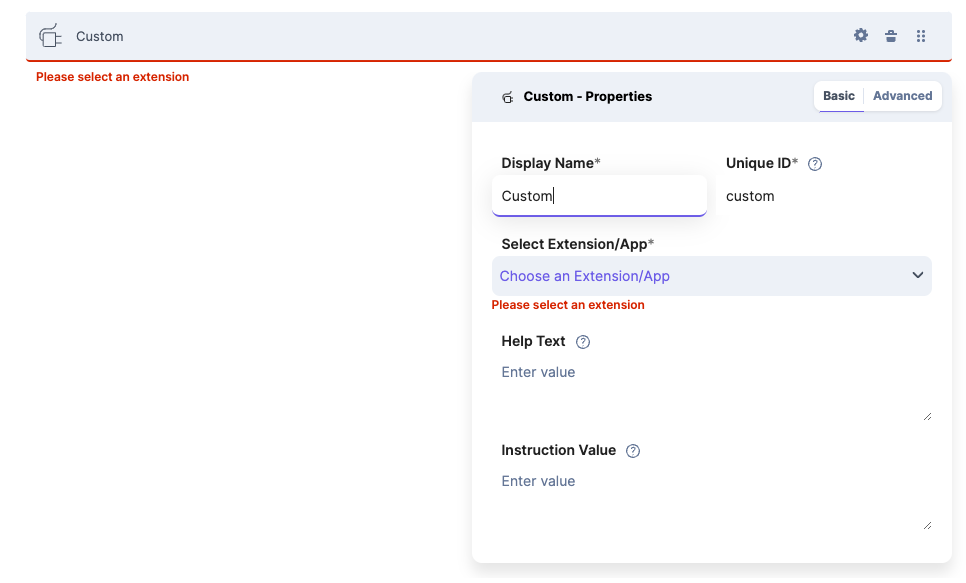
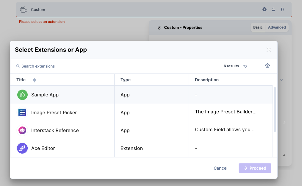
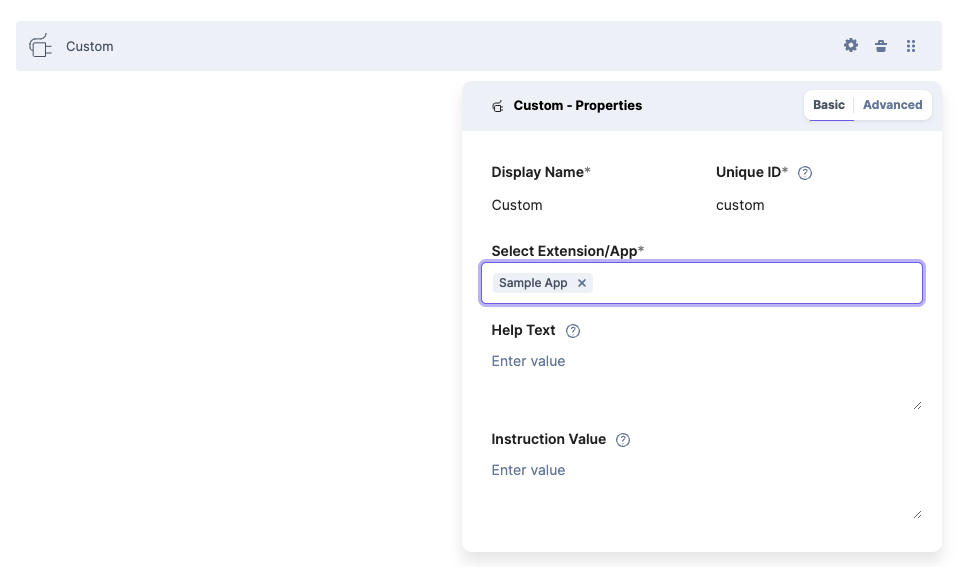
These screenshots illustrate the process of creating a content type with a custom field:
Once you have a content type that uses the custom field, go ahead an create an entry, you should see something like this:
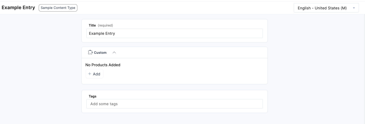
As you can see the "Custom" filed displays. Go ahead and click the +Add button. You will see the dialog popping up. This example provides an input field for you to enter a value. In a real-world scenario, you can display here available attributes from your Product Information Management system, and save those in the entry.
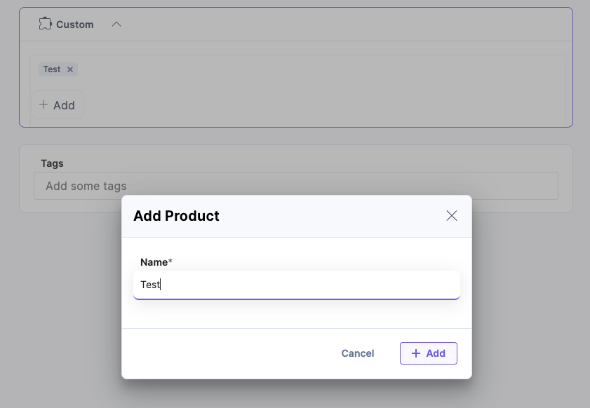
Next click Save to save the entry data. The value you entered will be persisted as part of the entry data and the next time you open it, it will be displayed in the custom field.
Tip: make sure you go over the entire code in the file to get a better understanding on how the logic is implemented.
If you want to learn more about this location, please visit our documentation: Custom Field Location
In the next module you will create a Stack Dashboard Widget.