

.svg?format=pjpg&auto=webp)
.svg?format=pjpg&auto=webp)
.png?format=pjpg&auto=webp)

.svg?format=pjpg&auto=webp)
.svg?format=pjpg&auto=webp)
.svg?format=pjpg&auto=webp)
.svg?format=pjpg&auto=webp)

.svg?format=pjpg&auto=webp)
.svg?format=pjpg&auto=webp)
.svg?format=pjpg&auto=webp)


.svg?format=pjpg&auto=webp)
.svg?format=pjpg&auto=webp)
.svg?format=pjpg&auto=webp)
.svg?format=pjpg&auto=webp)

.svg?format=pjpg&auto=webp)
.svg?format=pjpg&auto=webp)
.png?format=pjpg&auto=webp)
.svg?format=pjpg&auto=webp)
Set Up Live Edit Tags for Entries with REST
Live edit tags let you jump directly to the field that holds the content you are previewing. Clicking Edit next to a content block takes you to that field in the entry. If the field references another entry, you will be redirected to that entry’s editor instead.
Edit tags point to the exact location of a field within an entry. The Live Preview Utils SDK looks for elements that include these tags using the data-cslp attribute.
To enable this, pass the field location as the value of the data-cslp attribute in the following format:
{content_type_uid}.{entry_uid}.{locale}.{field_uid}
For example, home.blt80654132ff521260.en-us.json_rte
Note: If the field is nested within another complex field, such as Modular Blocks, use the following format to define the field path:
{modular_block_field_UID}.{block_UID}.{field_UID}
For a website built using Contentstack's JavaScript Delivery SDK, use the addEditableTags() method to automatically generate the edit tag. The following section explains how you can set up live edit tags using addEditableTags().
Set Up Live Editing Using the addEditableTags Method
Import the addEditableTags() Method
Import the method from the Contentstack SDK using the following command :
const Contentstack = require("contentstack"); const addEditableTags = Contentstack.Utils.addEditableTagsNote: The addEditableTags() method is also available in the Contentstack JavaScript Utils SDK package.
Locate the Stack.ContentType() Method
Go to the website code where the JavaScript Delivery SDK fetches entry content. Locate the section where you use the Stack.ContentType() method.
Here’s a sample code snippet demonstrating the use of Stack.ContentType():
let entry = await Stack.ContentType("content_type_uid").Query()
			.where("url", URL)
			.find();
Generate Edit Tags for Previewed Entry Content
After retrieving data using the Contentstack JavaScript Delivery SDK, pass the resultant entry to the addEditableTags() function to add edit tags to the previewed entry content:
addEditableTags(entry, content_type_uid, tagsAsObject, locale)Here, entry is the actual entry returned by the SDK, content_type_uid is the unique ID of the entry’s content type, and tagsAsObject controls the format of the edit tags.
Note: The addEditableTags() method doesn't return a value—it directly updates the entry provided as its first argument.
By default, tagsAsObject is false, adding data-cslp as a string like this:
'data-cslp=path.to.field'Note: This option is useful for React-based apps where attributes can't be added as plain strings and must be passed as destructured objects.
When tagsAsObject is set to true, the data-cslp attribute is returned in object format as shown below:
{ 'data-cslp': 'path.to.field'}The following sample shows how the code looks after applying the addEditableTags() method:
let entry = await Stack.ContentType("content_type_uid").Query()
			.where("url", URL)
			.find();
addEditableTags(entry[0][0], "content_type_uid", false, 'en-us')
The addEditableTags() method adds a new key-value pair at each level of the entry schema. This Edit Tag uses a dollar sign ($) as its key.
For example, pass the following entry schema as the first argument:
{
    "name": "John Doe",
    "description": {
        "occupation": [{
            "name": "Plumber",
            "since": 1920
        }],
        "height": "5ft"
    }
}
After executing the addEditableTags() method, the entry passed as the first parameter gets updated like this:
{
    "name": "John Doe",
    "$": {
        "name": "data-cslp=profile.blt8tvsk328dbw258.en-us.name"
    },
    "description": {
        "$": {
            "occupation": "data-cslp=profile.blt8tvsk328dbw258.en-us.description.occupation",
            "height": "data-cslp=profile.blt8tvsk328dbw258.en-us.description.height"
        },
        "occupation": [{
            "$": {
                "name": "data-cslp=profile.blt8tvsk328dbw258.en-us.description.occupation.name",
                "since": "data-cslp=profile.blt8tvsk328dbw258.en-us.description.occupation.since"
            },
            "name": "Plumber",
            "since": 1920
        }],
        "height": "5ft"
    }
}
Set Up the Live Preview Utils SDK
Live Preview uses the stack’s API Key and host URL to redirect to the relevant stack during editing.
ContentstackLivePreview.init({
	...
	stackDetails: {
       apiKey: "your api key",
   },
   clientUrlParams: {
       protocol: "https",
       host: "app.contentstack.com",
       port: 443,
   },
})
The clientUrlParams key is optional and defaults to the North America region. If your website is hosted on a different data center, use one of the following values:
- AWS EU: https://eu-app.contentstack.com/
- Azure NA: https://azure-na-app.contentstack.com/
- Azure EU: https://azure-eu-app.contentstack.com/
- GCP NA: https://gcp-na-app.contentstack.com/
- GCP EU: https://gcp-eu-app.contentstack.com/
Configure Live Edit Tags for Each Webpage
In your website’s front-end HTML code, navigate to the section where you want to add the edit tags. Use the field path from the entry and insert a dollar sign ($) before the last field.
For example, data.description.height becomes data.description.$.height.
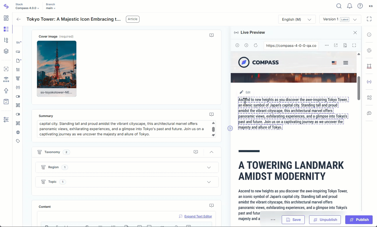
Once you add the edit tag, content managers will see the Edit icon when they hover over the corresponding content block.
<header class="text-center">
    <div class="author">
        <img {{ data.author.profile_image.$.url }} src="{{ data.author.profile_image.url }}" alt="{{ data.author.title }}" />
    </div>
    <h1 {{ data.author.$.title }}>{{ data.author.title }}</h1>
    <h2 class="author-job" {{ data.author.$.job_title }}>{{ data.author.job_title }}</h2>
    <p class="author-bio" {{ data.author.$.biography }}>{{ data.author.biography }}</p>
    <div class="author-social">
        <a href="mailto:{{ data.author.social.email }}"><ion-icon name="mail-outline"></ion-icon></a>
        <a href="https://www.twitter.com/{{ data.author.social.twitter }}"><ion-icon name="logo-twitter"></ion-icon></a>
        <a href="https://www.instagram.com/{{ data.author.social.instagram }}"><ion-icon name="logo-instagram"></ion-icon></a>
    </div>
</header>
In React apps, set tagsAsObject to true to get edit tags in object format. Pass the object by destructuring it directly within the JSX element.
Below is an example of an edit tag in object format:
    <h1 {...data.$.name}>{data.name}</h1>
    <p {...data.description.$.height}>{data.description.height}</p>
Note: This setup works only for websites using plain JavaScript on the front end. For websites using other programming languages, provide the entire path to the specific field manually.
Enable Support for Multiple Field Actions in Visual Builder
To allow users to add, delete, and reorder items in a multiple field using Visual Builder, add live edit tags for each instance. Attach the tag to the parent element of the field.
In the example below, page_components is a Modular Blocks field that holds an array of blocks. Each block maps to a component or HTML element, and its live edit tag is set using page_components__${index} on the $ object.
<div {...(entry.$?.page_components ?? {})}>
  {entry.page_components?.map((component, index) => (
    <div key={`component-${index}`} {...entry.$?.[`page_components__${index}`]}>
      <Section component={component}/>
    </div>
  ))}
</div>
By default, Visual Builder auto-positions the Add button based on the parent element and how its children are arranged.
To manually control the button’s position, use the data-add-direction attribute. Set it to one of the following:
- horizontal: Aligns the button horizontally
- vertical: Aligns the button vertically
- none: Hides the Add button
For example, setting the Add button to vertical alignment
<div {...(entry.$?.page_components ?? {})} data-add-direction="vertical">
  ...
</div>
Add CSS to Display Edit Buttons in the Project
Note: This step is not required for Live Preview SDK version 2.0.0 and above.
The styles for the live edit tags are available in the @contentstack/live-preview-utils/dist/main.css file. Import these styles in your main index.js file using npm as follows:
import "@contentstack/live-preview-utils/dist/main.css";Alternatively, add the CSS directly in your HTML using this code:
<link rel="stylesheet" href="https://unpkg.com/@contentstack/live-preview-utils/dist/main.css">
Configure the Edit Button using the editButton Object
The editButton object, in theLive Preview Utils SDK, allows you to manage and customize the Edit button for both the Live Preview portal and external apps.
It offers the following features:
- Enable/disable the Edit button
- Include/exclude the Edit button from inside/outside the Live Preview panel
- Adjust the position of the Edit button using eight over predefined positions
The editButton object contains four keys:
- enable
The enable key controls whether the Edit button is displayed. It accepts a Boolean value: true to display the button, false to hide it.
type default optional boolean true no - exclude
The exclude key lets you exclude the Edit button from either inside or outside the Live Preview panel based on specific conditions.
type default optional array [ ] yes It is of type “Array” and takes one of the following string values:
- insideLivePreviewPortal: Used when you want to remove the Edit button from within the Live Preview portal.
- outsideLivePreviewPortal:Used when you want to remove the Edit button from outside the Live Preview portal.
Note: Even if the Edit button is excluded from Live Preview, you can still display it outside the Live Preview panel by adding the cslp-buttons query parameter to your website URL.
- includeByQueryParameter
The includeByQueryParameter overrides the cslp-buttons query parameter. Set it to true to enable or false to disable the Edit button.
type default optional boolean true yes - position
The Edit button can be positioned in one of eight predefined spots within or over the Live Preview panel. Use any of the following values:
left, right, top, top-left, top-right, top-center, bottom, bottom-left, bottom-right, or bottom-center.type default optional string top yes Note: By default, the Edit button appears at the top position. In collaborative environments, you can manually place the button by adding the data-cslp-button-position attribute to an HTML tag and setting it to any valid position value.
For example:
    ContentstackLivePreview.init({
        ...
        editButton: {
            enable: true,
            exclude: ["outsideLivePreviewPortal"],
            includeByQueryParameter: false,
            position:'top-right',
        }
    });
More articles in "Work with Live Preview"
